AS THE SUPERINTENDENT OF THE U.S. CENSUS, FRANCIS AMASA WALKER SOUGHT TO MAP PATTERNS THAT MIGHT OTHERWISE HAVE REMAINED HIDDEN OR LOST. IN DOING SO, HE PAVED THE WAY FOR THE MODERN INFOGRAPHIC, WRITES HISTORIAN SUSAN SCHULTEN.
The 2012 election brought us a deluge of maps. They predicted the breakdown of the electoral and popular vote, analyzed the size of each party’s lead, explained the shift from past elections, and charted the influence of ethnicity, economic condition, and geography. Data maps–and their cousins, infographics–have become routine, used for everything from urban planning and research to marketing and economic speculation.

This explosion of population mapping owes much to the extraordinary geovisualization techniques of Francis Amasa Walker, a highly decorated Union soldier in the American Civil War. After the war ended, Walker found himself casting about. He taught languages for a few years and dabbled in journalism before his family connections brought him a job in the Bureau of Statistics. Walker had a knack for working with data, and at the tender age of 29 was appointed as superintendent of the Census of 1870. This position gave him the chance to think of the census not just as a tool of enumeration and political apportionment (its original purpose), but as an instrument of research and development. Think of Walker as an early advocate of data mining for the nation. To properly exploit the census, however, he had to make sense of the data, and this led him to experiment with maps and infographics.
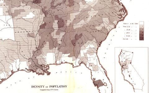
In 1872, he issued the first of several groundbreaking attempts to map the American population through the census. But instead of using preexisting units–such as county or state divisions–he took the more labor-intensive step of mapping the population according to its actual contours. By doing this, he moved closer to seeing the population as it existed in space, irrespective of political boundaries. Take a look at his map of the general population, which identifies six classes of density.

He then realized that this technique could be used to map various subgroups–immigrants, African-Americans–in addition to characteristics, such as wealth, illiteracy, or the incidence of disease. Armed with his experimental maps, Walker excitedly asked Congress to support a much more ambitious effort to comprehensively map and chart the census in an atlas. The maps did the trick, and Congress appropriated $25,000 for Walker to create the first national statistical atlas in the history of the world.
Then, after his project was funded, Walker began to think about maps in even more unconventional and adventurous ways. The first maps he made in 1872 (like that above) focused on a single class of information, such as population density, wealth, or illiteracy. By 1873, he realized that a far more complex–but perhaps useful–picture of the national population could be created by integrating two classes of data onto a single map. Take a look at his two maps of wealth, the first from 1872 and the second made soon thereafter.

The map at left shows the distribution of wealth in absolute space. It tells us that there is slightly higher per capita wealth in certain locations, such as the North relative to the South. But the map at right represents a fundamental departure: It maps not just the distribution of wealth in orange but also population density with blue contour lines and numbers (identifying areas of 2–18 per square mile, 18–45 per square mile, etc.). This second map opened up the radical possibility of connecting two types of information in space, such as the relation of wealth to population density. Walker used this same technique to map illiteracy, disease, the birth rate, public debt, and ethnic subgroups, each time incorporating the blue ink of population density so that the dynamics of the population could be seen.
With this quiet experiment, Walker audaciously inaugurated an entirely new purpose for the map, one that was analytical as well as descriptive. He was not the only one engaged in such work and, in fact, was deeply influenced by the examples brought from Europe by talented German immigrant mapmakers and lithographers. With this transatlantic collaboration, he conceptualized the map as not just a representation of data but a tool to uncover patterns and relationships. In other words, his maps were designed not just to illustrate the data but to transform that data into knowledge. Consider that without the map, these spatial patterns would be lost.
Here are two details from his maps of the colored population (on the left) and the foreign (on the right). The maps are nearly mirror images, suggesting patterns of migration and settlement that had much to do with the legacy of slave labor and the corresponding hostility to immigration. For Walker, the possibilities for mapping data such as this were nearly limitless.

This, of course, is the intellectual conceit behind our complex use of maps today, and especially behind Geographic Information Systems (GIS), where data is arranged spatially. But in the late 19th century, this was entirely new–so new that when Walker showed the maps to his colleagues (some of the most educated men in America), they were slow to grasp the potential of this new tool. He had to train them to think about a map in new terms.
Walker’s own politics were clear: The trouble with America was excessive urbanization and immigration. Notice in the slide show how many of the maps and charts identify and measure the foreign population. Such maps can be–and probably always will be–used to manipulate data to suit particular ends and political agendas. But Walker’s audacious experiment in the 1870s laid the foundation for the explosion of maps and infographics thereafter. As president of MIT in the 1880s, he insisted that students be trained not just in science and technology, but also the graphic visualization of data. For Walker, the communication of information was as important as the information itself.
[Images courtesy of David Rumsey Map Collection and Library of Congress]
Susan Schulten is the author, most recently, of Mapping the Nation, which surveys the explosion of graphic and cartographic knowledge in American culture. For more on the rise of infographics and thematic maps, seeCartographies of Time (2010) by Daniel Rosenberg and Tony Grafton, and the online exhibit “First X, then Y, now Z.”